The next-generation of data storytelling
What is the fastest and best way to empower your team to understand and act on data? The power of stories, data storytelling. Providing users with the most important information first, helps them focus on what’s important. Followed by the related context, and by letting them decide whether or not they want to deep dive into the data, you keep users informed and save their time. In Qlik, we use DAR methodology for this purpose – on the first sheet of the app, you have the overview of what’s the most important. However, the first sheet has limited space, and sometimes, relations between information are missing/misunderstood.
From now on, there is another Qlik-native option, Inphinity Flow 2.1!
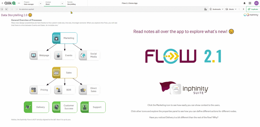
Inphinity Flow brings so much to the table in engaging users in the story behind the data. So much flexibility now in displaying a visual aspect that defines the process, the workflow, or the organization.
New action: Open master visualization
There is no better way to keep the user’s attention on a specific topic than to show them the related information only. The self-service comes next – once the user knows what issues need to be solved and which data should be explored, and only when there is time to do so.

As always, we’ve developed it in the most Qlik native way – not only for users but developers, too. You can use all Qlik master visualizations to be shown in the pop-up and they remain interactive, including those using extensions. Yes, extensions… Inphinity Forms, the write-back extension, too. 😉

Even more intuitive actions
The actionability that Inphinity Flow enables is what makes it far more than just a visualization tool. Steps of the process/calculation, part of the hierarchy you can click on and do a specific action is very powerful. It can make selections, redirects you to a related sheet, open an external webpage, from now on, shows you master visualizations in a pop-up, too, and much more. To know where to click right after spotting the visualization we’ve enhanced the UI of nodes. It saves you a millisecond at a time but the user doesn’t need to think about where to click, keeping the user focused!

Many new custom design options
To keep users focused, the tools that they use should remain as invisible and intuitive as possible, we have added many new options to customize Inphinity Flow so it fits wherever you use it.
Custom alignment: Now you can select from many options about how the visualization should be aligned inside its placeholder on the sheet.

Custom node size: There are new options in the additional node type definitions you’ll use often – custom width and height of a specific node type. Thanks to that you can manage how large specific nodes will be and keep users’ attention on the most important ones. And the auto-wrapping text we’ve added will save developers time so they can be focused on other things.
Node color by the expression: Make your what-if analysis very intuitive with the option to define node color by expression!

Line width by the expression: Highlight those lines that should catch attention – the most repetitive activity, the longest duration, unexpected behavior.. On the other hand, sometimes you want the line to disappear and have two unlinked flows instead. Yes, now you can do exactly that. In seconds.

New line types: Based on your use cases, which are often not processes but hierarchies instead, we’ve decided to support more types of how the line can start and end. This brings new options to processes, too, e.g. if there is a bidirectional relation.

Export officially supported now
You were asking, we listened 😎. First, we were cautious regarding what type of export would be supported in this release. Then our masterminds did their best to provide you the full support of export you know from Qlik native objects to both, image as well as pdf.

The export option is not currently supported in Qlik SaaS as it is not yet permitted for extensions on Qlik SaaS 😥. However, we’ll keep monitoring this.
Initial lock option (keep scrolling on mobile devices)
Do you know that feeling when you read a very interesting article on your phone, keep scrolling and reading, thinking about it, keep scrolling … and BAM! The interactive visualization ( most often a map) appears on your screen and instead of scrolling, you’re now zooming in? With Inphinity Flow you can avoid this distraction by locking the visualization by default. If the user wants to zoom in, it still can be unlocked by using a very intuitive button in a navigation menu.

I hope that what’s new in Inphinity Flow kept you focused and excited until the end of this article! Now it’s time to use it in your apps 😉.
If you want to get technically inspired watch the TechTuesday video series.
Follow us on LinkedIn to not miss any news from the Inphinity data analytics world!
Enjoy Inphinity Flow 😉!


